Start with a product reference and a short preservation brief
Use a clear product photo you have permission to use. Keep its outline, cap or handle, material and label visible; add a second angle if an important part is hidden. Identify which image defines the product and which only suggests a mood.
Open a template with “Use this template”, add the reference in the image studio, then replace the example product description with your own. For a real branded product, replace conflicting phrases such as “unbranded”, “no label” or “no logos” with an instruction to preserve your supplied packaging. The original prompts below remain complete.
Try this brief before the scene description:
Use the attached product photo as the identity reference. Preserve its silhouette, proportions, material, main colors, cap or handle, label placement and supplied lettering. Change only the background, lighting and supporting props described below. Do not add another product, new branding or performance claims. Keep the entire product visible. If lettering or construction is unclear, ask for a clearer reference rather than inventing it.
For more on separating references, see the reference-image guide.
1. A quiet tabletop for ceramics and small objects
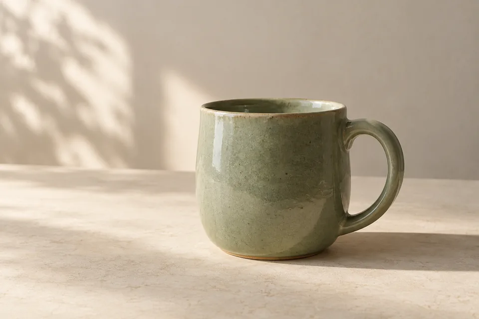
Start here when the shape and surface need to do most of the work. The soft side light reveals glaze, while a restrained background leaves room around the product. Replace the mug description with your object and its actual material. Check the handle opening, rim thickness and contact shadow before choosing a result. A lifestyle scene may not meet a marketplace’s main-image requirements; check the intended placement separately.
A quieter kind of product photo
A product photograph of a single unbranded sage-green ceramic mug on a warm ivory tabletop. Show subtle glaze texture, a rounded handle and soft side light against a neutral studio background. Landscape 3:2, with breathing room. No text or extra objects.
Use this template2. A botanical setting for a bottle
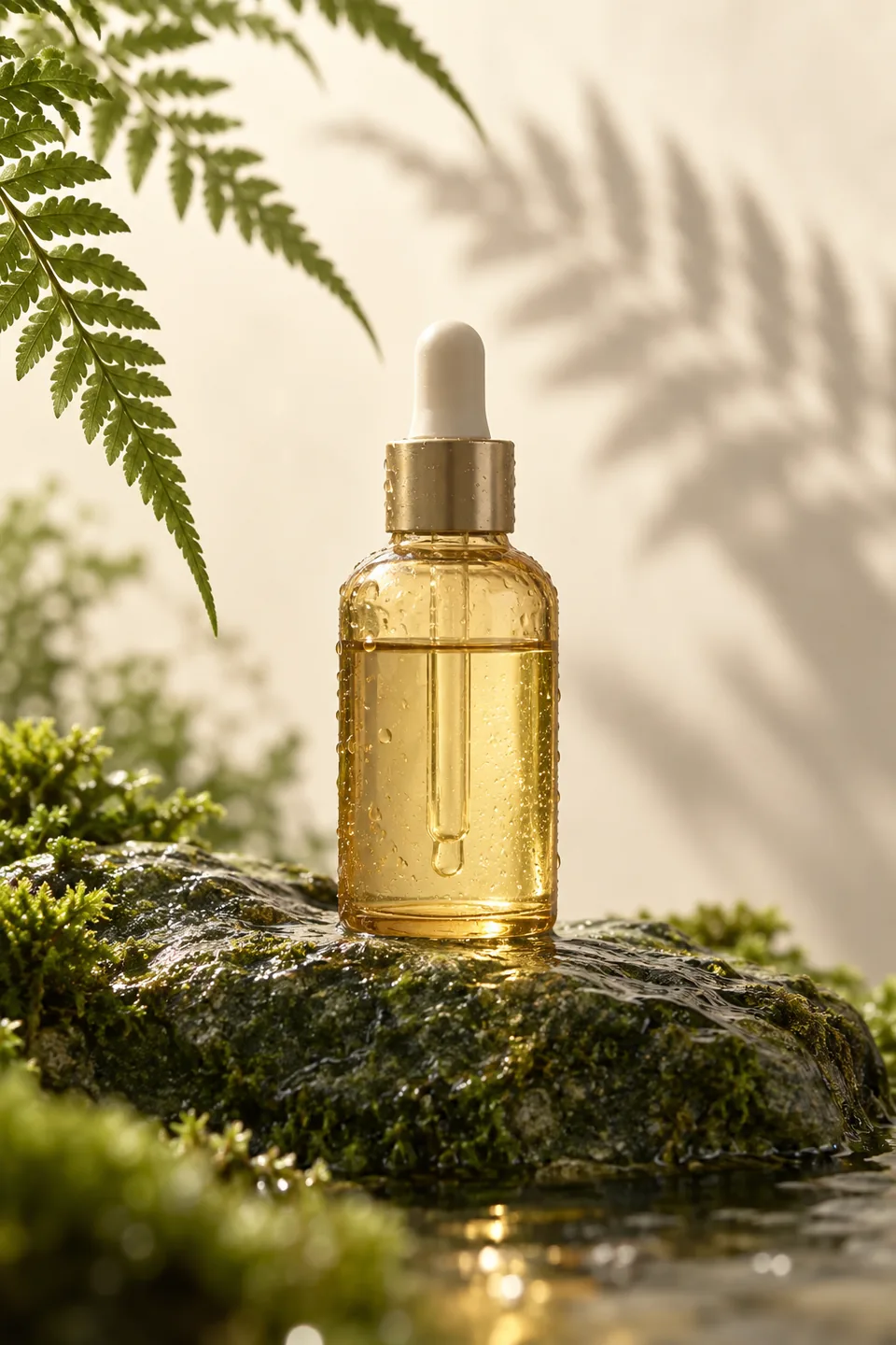
The fern shadow and moss-covered stone give this scene its character. Keep foliage away from important packaging details. If your product is opaque, remove the glass reflections and liquid-meniscus instructions; if its packaging should look dry, remove condensation too. Keep any product claims out of the image unless you have supplied and checked the wording.
A drop of green
Original premium skincare product photograph, portrait 2:3. A single unbranded pale amber glass dropper bottle on a wet moss-green stone, one fern shadow crossing a warm cream backdrop. Tiny believable condensation droplets, accurate glass reflections, subtle liquid meniscus, generous negative space, softly diffused backlight. Fresh quiet botanical mood, natural imperfect textures and restrained art direction. Bottle has no label or writing. No efficacy claims, medical graphics, brand, text, watermark or extra bottles.
Use this template3. A citrus campaign with a clear focal point
Use this when you want an advertising composition with a hand, a hero bottle and a controlled splash. The complete prompt includes composition, action, lighting, copy space and quality checks. Keep those instructions together. Adapt the fruit and palette to your product, then inspect the fingers, label, liquid and perspective. A splash should support the bottle rather than cover it.
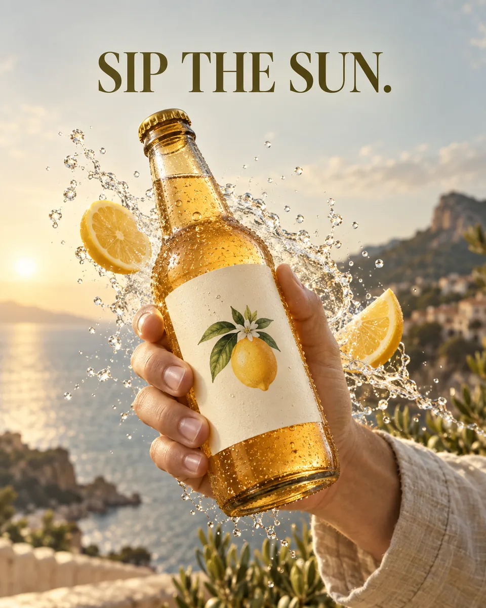
A splash with a point of view
Design one vertical 4:5 commercial poster for a fictional, unbranded sparkling citrus drink in a clear amber glass bottle with a plain cream label. If a product reference is attached, use that product instead and preserve its silhouette, cap, packaging, label, approved logo, colors, proportions and supplied lettering. Do not invent a real brand or endorsement. Capture one decisive human interaction: a single anatomically correct adult hand brings the bottle toward the camera at a slight diagonal. The bottle is the largest, sharpest object in the foreground. Keep the label facing the viewer, unobstructed and undistorted; retain the bottle's true geometry instead of exaggerating it with wide-angle distortion. Only the hand and a short section of sleeve are visible. Build one controlled, category-related action around it: a curved splash of clear sparkling water, a few fine droplets and two citrus slices, frozen at the peak of motion. Every effect must originate plausibly from the scene and follow gravity and the gesture. Leave the label, fingers and headline clear. Use dramatic side lighting, a delicate rim, physically credible glass reflections, condensation, shallow depth of field and restrained warm yellow, cream and olive color grading. Keep photographic material detail rather than a glossy plastic render. Reserve clean negative space in the upper third. Set exactly this three-word English headline: SIP THE SUN. Use confident, readable editorial typography, a clear hierarchy and comfortable outer margins; the type supports the product rather than competing with it. Do not add other claims, prices, seals, ratings or a fake logo. If the user supplies their own authorized brand, reproduce only the supplied brand information. Verify one bottle, one plausible hand, three correctly spelled headline words, clear packaging, believable fluid behavior and a coherent light source. No duplicated bottle, detached fingers, unreadable label, clutter, watermark, impossible anatomy, unrelated particles or misleading health claims.
Use this template4. A coffee scene caught mid-pour
The useful detail is the connection between the server, the stream and the cup. Preserve your cup’s actual handle and glaze, then check that the stream enters the opening rather than passing through the rim. Change one variable at a time: first the product, then the direction of light, then the background. This is a still campaign image, so describe one decisive instant.
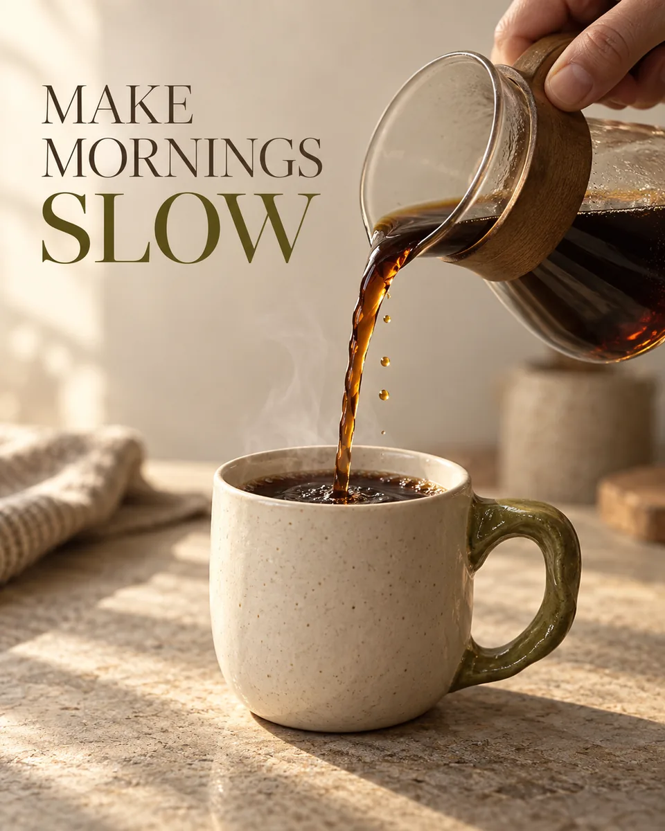
Slow mornings, caught mid-pour
Create a vertical 4:5 premium coffee campaign poster. The hero is one original, unbranded ivory ceramic cup with an asymmetrical olive-glazed handle. If the user supplies a product photograph, lock the cup's actual silhouette, handle shape, glaze, proportions and approved branding to that reference; do not replace it with a generic cup. Show a cropped adult hand naturally holding a small coffee server just above the upper-right edge of the cup. Capture one continuous stream entering the cup at the correct point, with a tiny believable ripple and a few suspended droplets. The cup is the sharpest, largest object in the lower foreground; the pouring vessel and hand remain secondary. Keep fingers, grip, stream, rim and liquid level physically consistent. Do not duplicate the cup or create a floating disconnected stream. Use a quiet warm-stone tabletop, a softly defocused cream background, early sunlight from the left, subtle edge light, realistic ceramic microtexture, soft contact shadows and warm brown reflections in the coffee. A faint ribbon of steam may rise from the cup without covering the handle, hand or words. Use restrained cream, coffee brown and olive; no unrelated leaves, excessive particles, artificial glow or plastic CGI finish. Keep shallow depth of field but enough sharp detail to read the product's construction. Leave the top-left third mostly empty. Typeset exactly three English words, MAKE MORNINGS SLOW, in a crisp, considered editorial hierarchy. Keep comfortable margins and a readable contrast. Add no price, invented certification, health claim, fake review, real company logo, signature or watermark. If an authorized logo is supplied, retain its original shape and place it discreetly without competing with the headline. Before finishing, check product identity, the single pouring action, natural hand anatomy, continuous liquid trajectory, three-word spelling, one coherent lighting direction and an uncluttered composition. Aim for a candid human moment finished with the care of a magazine advertisement.
Use this template5. Explore 36 directions before committing to one
A contact sheet helps you compare lighting, materials and settings for the same product. The full prompt below retains the layout, product-consistency rules and instructions for exploring 36 distinct directions. It requests one square image with a 6 × 6 layout, not 36 separate high-resolution files. Use it to choose a direction; then request that cell’s composition as a separate image using the original product photo again. Inspect the actual grid and product details before relying on it.
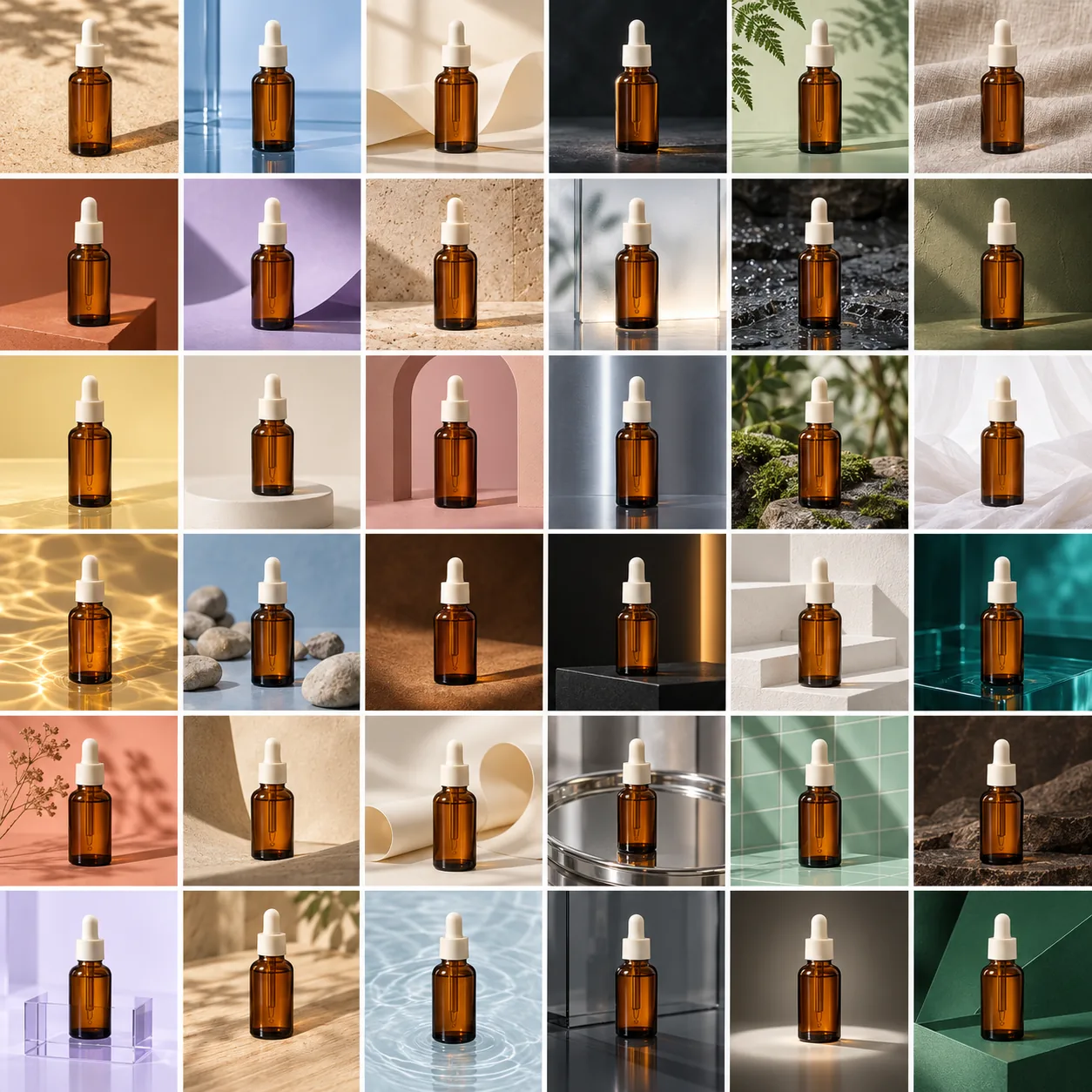
One product, thirty-six art directions
Create ONE high-resolution square product-photography contact sheet with exactly thirty-six equally sized cells, in six rows and six columns. Keep clean, consistent gutters and a clear reading order; no missing, merged or enlarged cells. Every cell must be a finished professional photograph with realistic materials, correct proportions, plausible perspective, coherent light, contact shadows and controlled reflections. Keep the entire grid visible, with crisp detail and a consistently high-end commercial standard. No added text, logos, labels, watermarks or imitation of a recognizable brand campaign. Overall canvas ratio 1:1. This is one composite image, not thirty-six independent outputs. A reference explicitly supplied for visual mood guides lighting quality and aesthetic; a reference supplied for product identity determines that product, not the background. SAME PRODUCT, BALANCED VARIETY: use the identical product in all thirty-six cells. If a product reference is provided, preserve its silhouette, structure, proportions, material, closure and supplied label details throughout. Otherwise use one original unbranded amber glass serum bottle with an ivory dropper cap. Create thirty-six distinct, tastefully coordinated studio art directions. Vary background colors, surface materials, light direction and softness, camera angle, supporting props and styling. Explore sand, water, folded paper, stone, leaves, linen, colored acrylic, ceramic, plaster, wood and glass without repeating a complete setup. Keep product identity, recognizability, image quality and the overall premium aesthetic consistent. Props support the product and never obscure it.
Use this templateRefine a result without redesigning the product
If the scene is close but a detail is wrong, describe that change precisely and keep the original reference attached. A reusable follow-up:
Keep the product identity and camera angle from my references. Correct only the following detail: [describe the mismatch]. Preserve all other proportions, materials, packaging and colors. Keep the entire product inside the frame, with a believable contact shadow. Do not add props or rewrite the label. Return one revised still image.
A prompt is a request, not a guarantee of exact packaging reproduction. For critical logos, ingredients or small print, compare at full size and use the approved original artwork in your finishing process.
Before using the image
Is the product still accurate? Compare silhouette, cap, handle, color, quantity and label with the reference. Check reflections, fingers and liquid paths where relevant.
Can I make several alternatives? The image studio offers 1–4 images per request. Use a small batch to compare a chosen direction. A 36-panel contact sheet is still one requested image.
Is image generation free? Reading the templates is free; generating images requires sign-in and uses Credits. See current pricing.
Ready to make your own scene? Open the product photography workflow or choose one of the full templates above.
A starter message is filled in for you to edit and send. Chat is billed by usage; clear image requests generate directly and use Credits.