Give the photograph a precise job
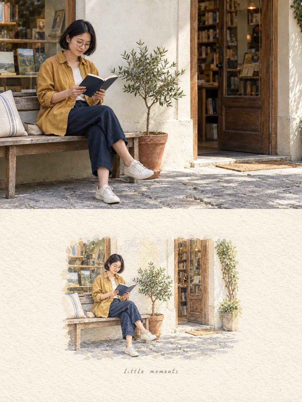
Choose a clear photo you own or are allowed to use. A visible face, complete hands and a recognizable setting make comparison easier. In the template, the uploaded photo controls identity and composition: hairstyle, clothes, body proportions, gesture, important objects and camera angle. It is not merely a mood board.
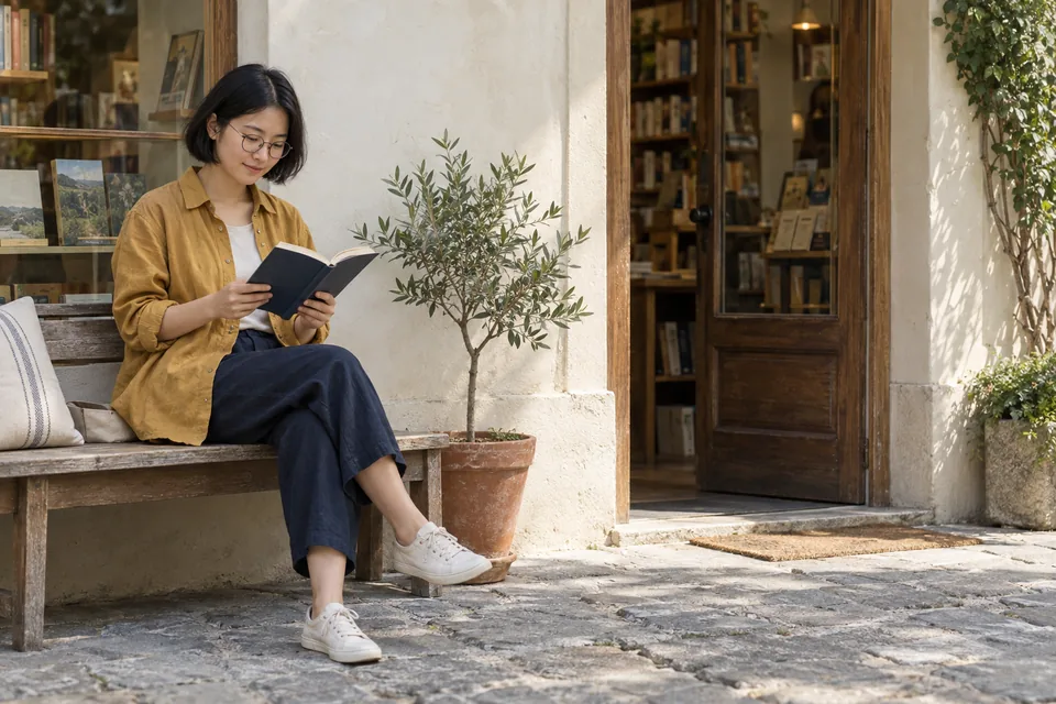
For our example, the anchors are round glasses, a mustard overshirt, an open navy book, crossed legs, a wooden shop entrance and an olive tree. Write your own short anchor list before generating. This prevents “editorial” from becoming permission to invent another person.
Change the medium across the whole scene
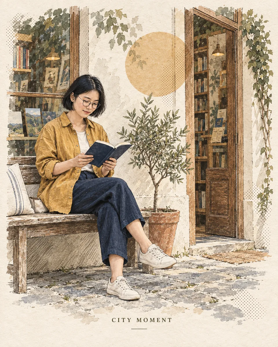
Use a small number of complementary techniques: fine ink contours for structure, crosshatching for shadow, watercolor for larger tones, and sparse halftone or screen-print marks for texture. The shop and pavement should receive the same treatment as the person; a drawn face over a photographic background feels unfinished.
Derive a faded palette from the photo. Warm ivory paper, brown and olive plus one or two existing accents are enough here. Keep some paper visible. A small geometric shape may balance empty space, but should not cover the face, hands or book.
Make the first version in Sparkles Editor
Open the template below and select Use this template. In Image studio, add your reference photograph, retain the complete prompt and choose a supported portrait size close to 4:5. Start with one image so you can inspect the translation before spending Credits on variants.
Replace CITY MOMENT if you want another short heading. Include a place or date only if it is real and supplied by you. If you would rather work through the assistant, ask it to turn your attached photo into an editorial paper print while keeping the listed anchors. This intent loads the corresponding creative skill.
Compare structure before judging texture
Compare the source and result side by side. Check face shape, hair, glasses, fingers, clothing seams, book orientation and the perspective of the shop. Then inspect the palette, empty space and text at phone size. Our example retains the reading scene and recognizable clothing, while redrawing the surface and some small details; it is not a pixel-identical transfer.
If the face drifted, strengthen the identity constraints before adding more style words. If the layout is sound but one hand is wrong, try a focused region edit. Download a result you want to keep. Avoid claiming that an AI restyling is an unedited photograph.
The complete prompt
Use the full instruction below, then change only the subject-specific wording. Composition, identity, setting, texture, typography and exclusions remain together.
A city moment, printed on paper
Create one vertical 4:5 editorial art print from the attached photograph. Treat the photograph as the identity and composition reference, not as a suggestion to invent a different person. Preserve the visible face, hairstyle, clothing construction, body proportions, pose, gesture and important objects. Keep the subject recognizable while translating surfaces into drawing. Rebuild the setting with a few informative shapes: the shop doorway, window, pavement, furniture or plants that actually appear in the reference. Keep their relative positions and perspective; simplify secondary detail instead of replacing the location. Use fine ink contours, irregular sketch marks, delicate crosshatching, sparse halftone dots, translucent watercolor and slightly imperfect screen-print registration. Avoid a photorealistic background behind an illustrated subject. Derive a limited, faded palette from the reference: warm ivory paper, muted brown and olive, plus at most two restrained accent colors already present. Let subtle paper fibers remain visible through thin washes. Add a small circle or geometric shape only where it supports the composition; do not cover the face, hands or key object. Leave generous calm negative space, especially along one side, and keep the figure as the main visual anchor. Typography: one small line reading CITY MOMENT near the lower margin, clean and readable. Add a real place, date or coordinates only when the user provides them; otherwise omit them. Do not invent a travel record. No brand logos, artist signatures, watermark, ornamental border or extra slogans. Check the final image against the reference: same person, outfit, gesture and scene; correct anatomy; coherent perspective; restrained print texture; readable type and balanced margins. No glossy 3D, saturated neon, excessive detail, duplicate people or a new face.
Use this templateWhere this direction came from
The method was informed by simeon-sanai’s editorial-print post on X, reviewed on September 24, 2026. Sparkles Editor’s prompt, fictional subject and example are newly made; the post’s image and person were not reused. Continue with the reference image guide if you want to combine subject and lighting references.
A starter message is filled in for you to edit and send. Chat is billed by usage; clear image requests generate directly and use Credits.