손그림
노트 속 작은 숲
그림과 설명을 나란히 놓아 자연 관찰을 쉽게 전해요.
전체 프롬프트
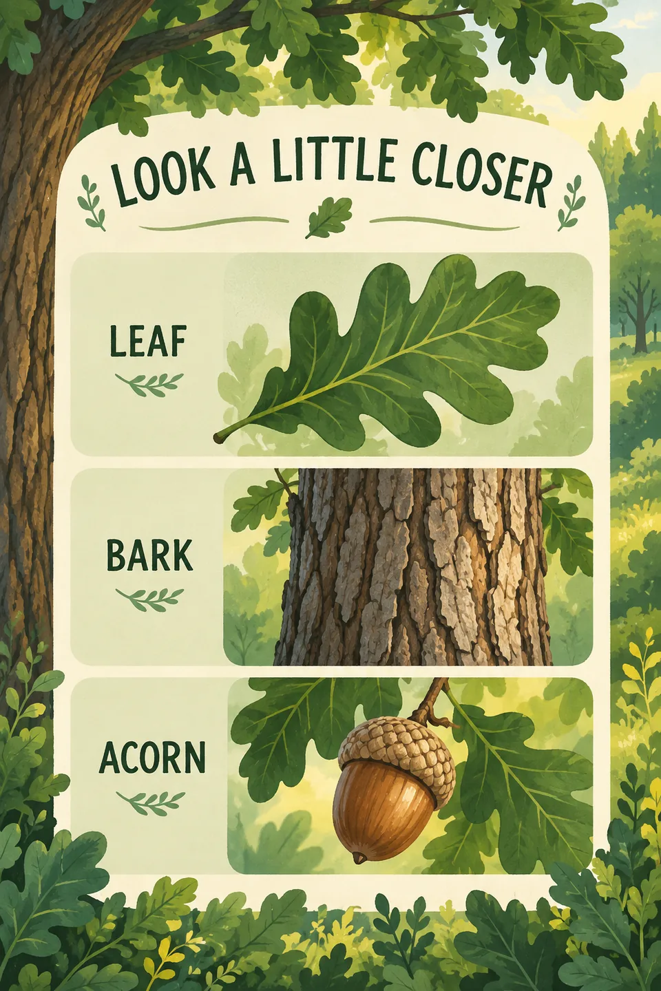
Subject: 참나무 관찰 카드. 제목 “조금 더 가까이”. 세 줄: “잎”과 갈라진 초록 참나무 잎, “나무껍질”과 줄기 질감, “도토리”와 깍정이가 붙은 도토리. 다른 사실이나 수치는 추가하지 마세요. 세로 2:3. Visual style: A new-naturalist forest fairy-tale picture-book illustration: children coexist with nature; figures are small, cute, rounded and simply shaped, while natural plants dominate the picture. Light green, grass green and deep green with a few warm accents. Soft natural light, dappled tree shadows and backlit translucent leaves; dew, raindrops and water-surface highlights. A rich environment without excessive photorealism; simplified but rhythmic plant silhouettes. Combine children’s picture-book illustration with animated-film backgrounds. Warm, quiet, airy and full of life. A modern decorative flat forest fairy-tale approach: strongly two-dimensional, rounded geometric plants, broad solid-color shapes, restrained perspective and subdued light and shadow. Simple, childlike, peaceful, comforting, with a decorative-poster character. Layout: Xiaohongshu infographic. Highly versatile multi-row text-and-image structure. Layout: place a prominent headline area at the top (can include main title, subtitle, date/tag, or category slogan). The main body consists of multiple vertically stacked, uniformly spaced item rows (typically 3–5 tiers). Each row uses a consistent side-by-side structure with text information on the left (timestamp, subhead, tags, descriptive bullets) and the corresponding illustration or photo on the right, maintaining neat horizontal alignment across all rows. The bottom section can include summary notes, practical tips, or a brief closing remark. This layout is broadly versatile, seamlessly supporting daily travel itineraries, timeline routes, catalog overviews, curated lists, step-by-step processes, as well as multi-item comparisons. Palette: Theme color: Forest Green. Forest green, lighter botanical greens and a little warm yellow. The subject brief is the sole source of content; style changes rendering only. Do not add unrequested brands, characters or artist signatures. Retain every requested module, quantity, action, composition, detail and constraint; do not summarize them away. Explicit user content, exact copy, color and no-text requirements take priority. A selected palette overrides only the style’s default colors, preserving its other characteristics. If the subject requests no text, draw no lettering, even in a layout with text areas. Otherwise integrate typography into the composition. Preserve any exact copy in the brief; otherwise develop meaningful copy in the subject’s language instead of literally describing the picture. For conceptual subjects, design a human or nonhuman visual metaphor first, then integrate words and image into one composition. Never shorten supplied copy unless asked. Use only supplied places, data and facts; never invent opening hours, prices or distances.