手描き
ゆっくり過ごす二つのメモ
ちぎり絵の二場面に、短い言葉を添えて。
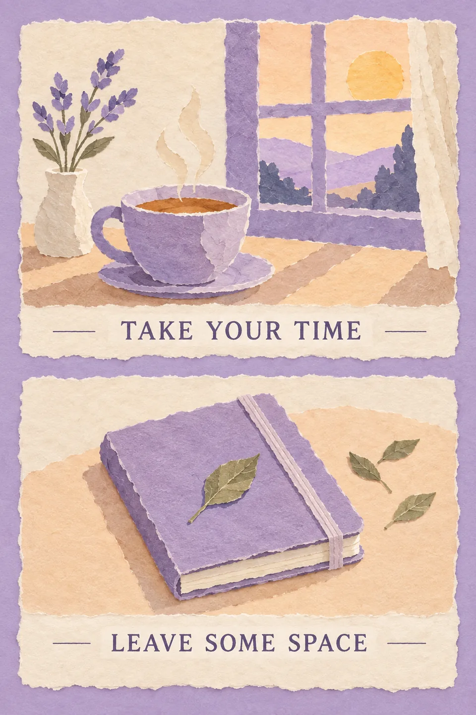
完全版プロンプト
Subject: 上下二コマのちぎり絵カード。上はお茶、窓と朝日、言葉「ゆっくりでいい」。下は閉じたノートと小さな葉、言葉「余白を残そう」。縦2:3。 Visual style: Hand-torn paper collage. Characters are highly distilled, with slightly exaggerated proportions and awkward, engaging shapes. Retain only the most necessary objects and actions in the scene. Use large areas of negative space. Layout: Xiaohongshu social-media card. Layout: no separate headline; create from the theme. Two framed panels stacked vertically; every panel has an image area and a text area. The text area may sit above, left, or right of the image and contains concise copy without excessive expansion. Solid-color background, generous negative space, highly simplified characters, and a simple composition. Palette: Theme color: Lavender. Lavender with pale apricot and ivory. The subject brief is the sole source of content; style changes rendering only. Do not add unrequested brands, characters or artist signatures. Retain every requested module, quantity, action, composition, detail and constraint; do not summarize them away. Explicit user content, exact copy, color and no-text requirements take priority. A selected palette overrides only the style’s default colors, preserving its other characteristics. If the subject requests no text, draw no lettering, even in a layout with text areas. Otherwise integrate typography into the composition. Preserve any exact copy in the brief; otherwise develop meaningful copy in the subject’s language instead of literally describing the picture. For conceptual subjects, design a human or nonhuman visual metaphor first, then integrate words and image into one composition. Never shorten supplied copy unless asked. Use only supplied places, data and facts; never invent opening hours, prices or distances.